Type of work
flexible architecture, Renovation
Building type
apartment
Use
residential
City
Bologna
Country
Italy
Year
2013
Client
Private
Plot area
110 m²
Floor area
320 m²
Floor plan
320 m²
Area of intervention
110 m²
Cubic volume
330 m³
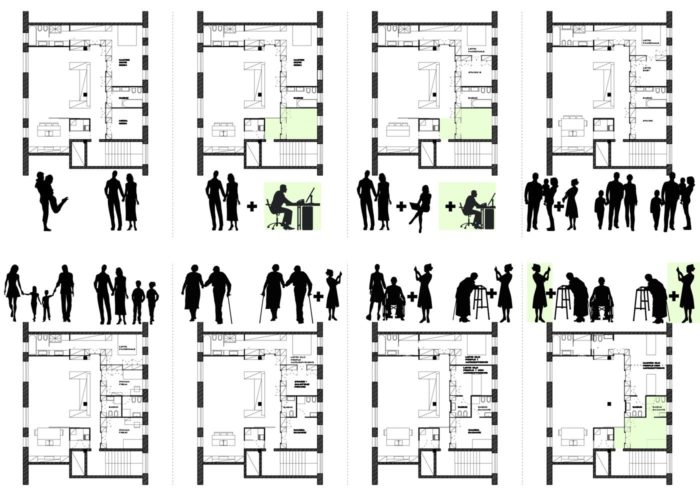
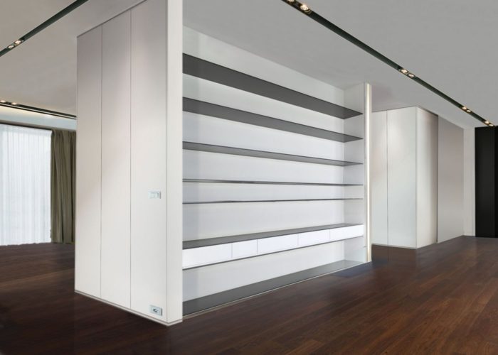
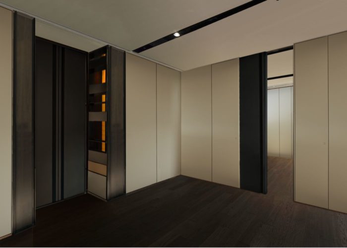
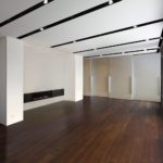
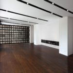
“We want a flat capables of being or becoming fit often by modification. A living space that change concurrently as our working and emotional couple life do.” That was the strictly statement comes out from our client. Our goals it has to project a room that has in its design the characteristic to embody spatial, structural and service strategies, which allow the physical space a level of malleability in response to changing needs over time. We work alot along customer thoughts and that’s make us chose a Soft Flexibility approche because it allows the client themselves to change the layout to accommodate the emerging needs or new functional patterns without tying the apartment spatial configuration according planimetric schemes defined a priori and we design a circular flow of space around the flat’s heart (fireplace-library-main plants). This Flexibile architecture aproach allows the space to adjust to changing needs (personal, practical…) and patterns (demographic, economic, or health-care..), both technological, private and emotionals. There are no fixed funcion area, apart the kitchen, so different areas could be modified in times. New bathoom could be relized in the future, thanks to already realized strategic plant configuration.
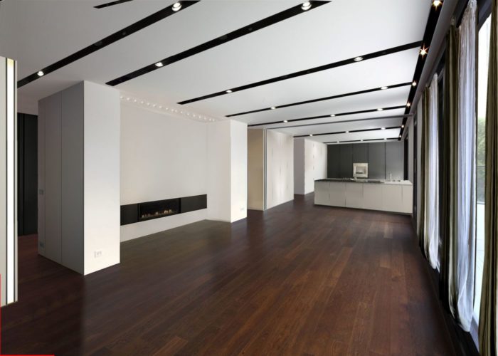
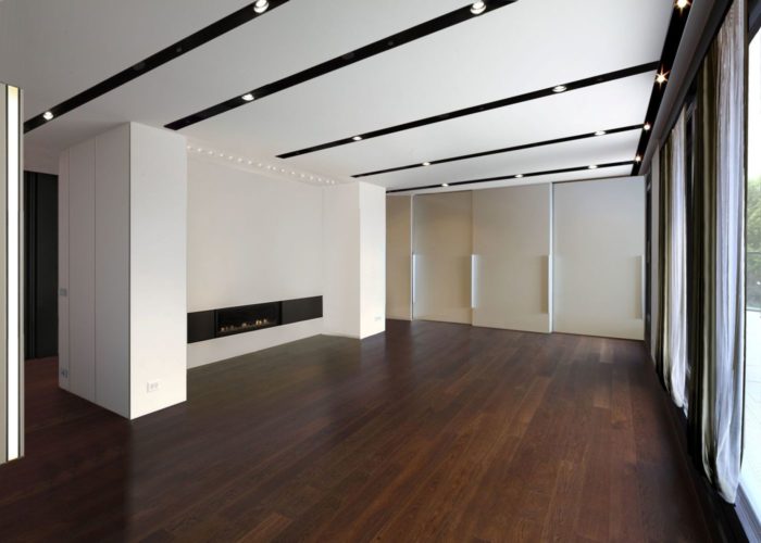
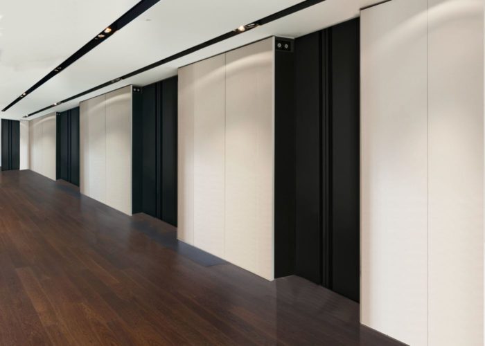
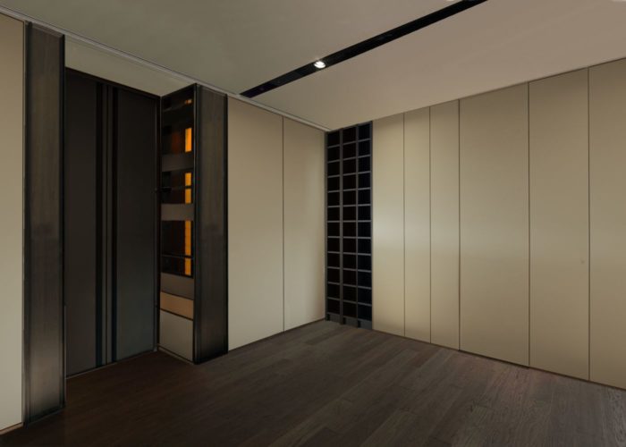
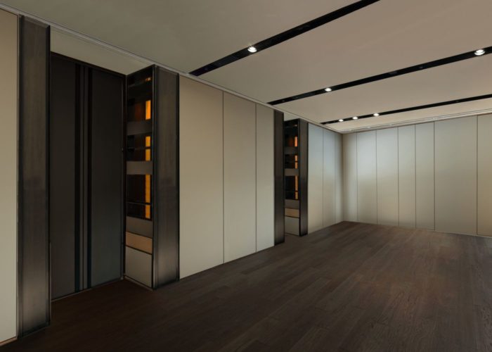
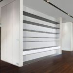
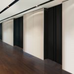
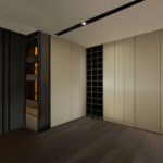
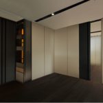
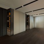
Custom-made wooden insulated cabinetry create divisions within the home and they manage future layouts. The fixed partition (bathroom and fireplace’s volume) were drywall made and realized easy to modify. Sliding doors, openable cabinery doors and custom modular cabinet partition are the way to changing easily the flat configuration, both in single room scale or in all flat surface.
To avoid cluttering, appliances are built-in cabinetry ensuring that the home remains uncluttered and free to change within maximised the space.
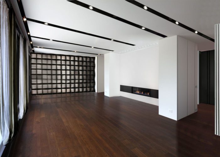
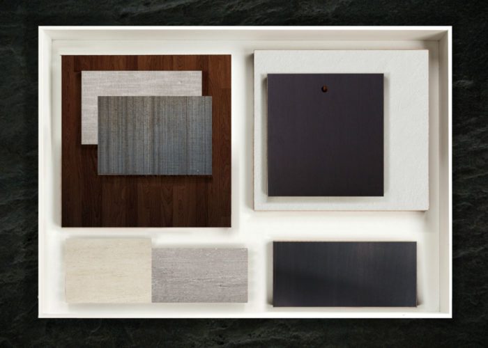
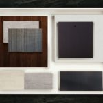
The apartment’s aesthetic reflects the choice of clean at first sight approach, so minimalist style had been chosen. A saturated warm shadow of eggshell white is the vertical hue that match perfectly with the hard azobè continuous wood floor, metal and dark spotlight element are introduced to give richness to all.


